Why styled-components in React

As an introduction of style-components I as that styled-components is a massively growing community around with over 22,000 on GitHub, mostly coming from React developers, which is very encouraging and speaks to the prospects of longevity.
Styled components are a CSS-in-JS tool that bridges the gap between components and styling, offering numerous features to get you up and running in styling components in a functional and reusable way. In this article, you’ll learn the basics of styled components and how to properly apply them to your React applications.
Reasons to use styled-components:
Performance improvements
Styled components keep track of which components are rendered on a given page and inject their styles and nothing else. This means your user loads the least amount of styles necessary for a given component.
Reusable components
Styled components allow us to create components that are extremely easy to reuse as they directly contain their style values.

No-class policy:
Styled-components enforces the use of props in the place of classes. This no-class policy has helped them make more developers tow the route of best practices for controlling the behavior of a component.

Native mobile support
For teams with a React codebase who also use React Native for mobile development, styled-components is one of the best-unified solutions out there for you. If consistency across platforms is a priority, then you would be glad to find out that styled-components can be bundled into React Native.
In React Native with styled-components, you can just assign alias names to comments making your JSX code very legible. Also, you can convert any component even custom components to a styled component by simply invoking styled().
What We Found Slightly Frustrating About Styled Components
There were certain style rules that we found hard to apply to Styled Components; namely, rules that set the placement of an element on a page (e.g. margin or display properties). They were difficult to standardize, so we still ended up leaning heavily on plain ol’ CSS for component placement in the flow of elements.
The syntax of Styled Components also takes some time to get used to, but if you’re familiar with template literals then it shouldn’t be too much of a stretch. Also, Styled Components does a great job with its docs and has been in the ecosystem for long enough that there are many examples around the internet!
Example of Styled-Components:
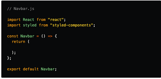
The Navbar component
This component will simply contain 3 links on its right and be displayed at the top of our view.
Start by creating a Navbar.js file under /src/components/.
Import both react and styled from React and styled-components respectively. Finally, create and export a Navbar component that doesn't return anything yet.
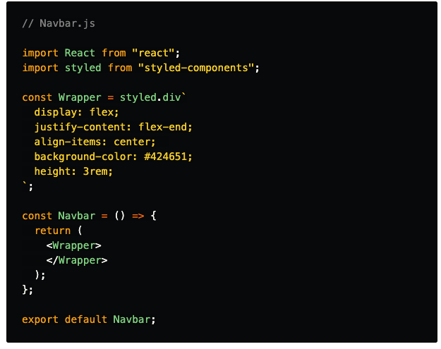
We now want to create a Wrapper styled component that will wrap around our links. Make sure to set its styles, including flexbox in order to align your items at the end of the container.
Finally, make sure that your Navbar component returns the Wrapper.
Next up, we want to create a styled component that will take care of displaying our links. Create NavbarItem using the a tag, don't forget to set its :hover style !
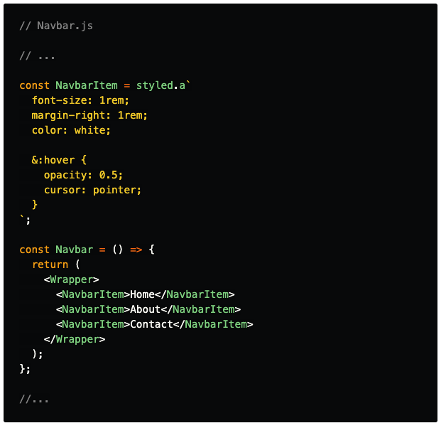
Alright ! You’ve created the Navbar component from scratch, the thought process behind styled components may seem a bit hard to grasp at first, but it'll get more and more intuitive after each step.
Let’s now create our card-related elements 😃
